Ambience and environment matter more than ever when you’re competing for customers. It’s not just that we need to match the look of the best high-street retailers. We need to create an experience which is worth getting off your sofa for. So much can now be done online from home — the experience of making a physical visit to a library must be rewarding in itself to keep people coming.
The interior scheme is part of your marketing message — don’t let personal taste take over
Use classic colour theory rather than what’s on trend so it won’t date
Make choices practical and sustainable — how good will it look in five years’ time?
Create a welcome for all users — balance the scheme to differentiate not alienate
Use design to throw focus onto products and services — not secondary to a bold statement
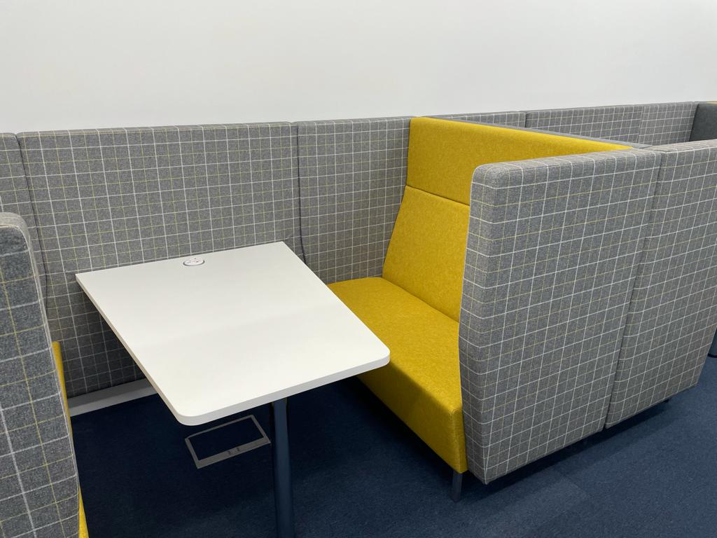
Manage large spaces by creating smaller, intimate ‘rooms’ using rugs, tables, seating and lamps
Choose furniture that’s comfortable and appropriate to the needs of the customers
Clean and clear lines invite exploration — give the eye the chance to rest on key features
Don’t draw attention to awkward features — use neutral colours to disappear them
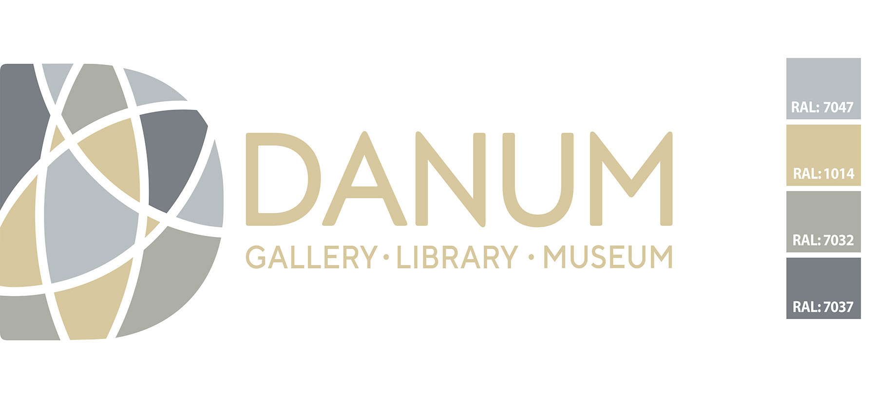
Integrate manifestations and signage with coherent graphic themes relevant to the community
A coherent colour scheme brings a sense of calm and wellbeing as well as sensory reward. It can uplift the mood of your visitors and affect how we perceive the size of spaces and even their temperature. A mismatched environment feels stressful and effortful in comparison; it’s hard to ‘read’ and there is no rest for the eyes.
At Opening the Book we specify floor and wall finishes as well as laminates for desks and bookcases and fabrics or vinyls for seating. Choosing for a library is not the same as choosing for your own living room. It’s about the messages you want to convey — impressive or friendly; comfortable or with contemporary edge; spacious or full of stimulus. There is no one right answer; we help you work out the best mix for your target audiences.
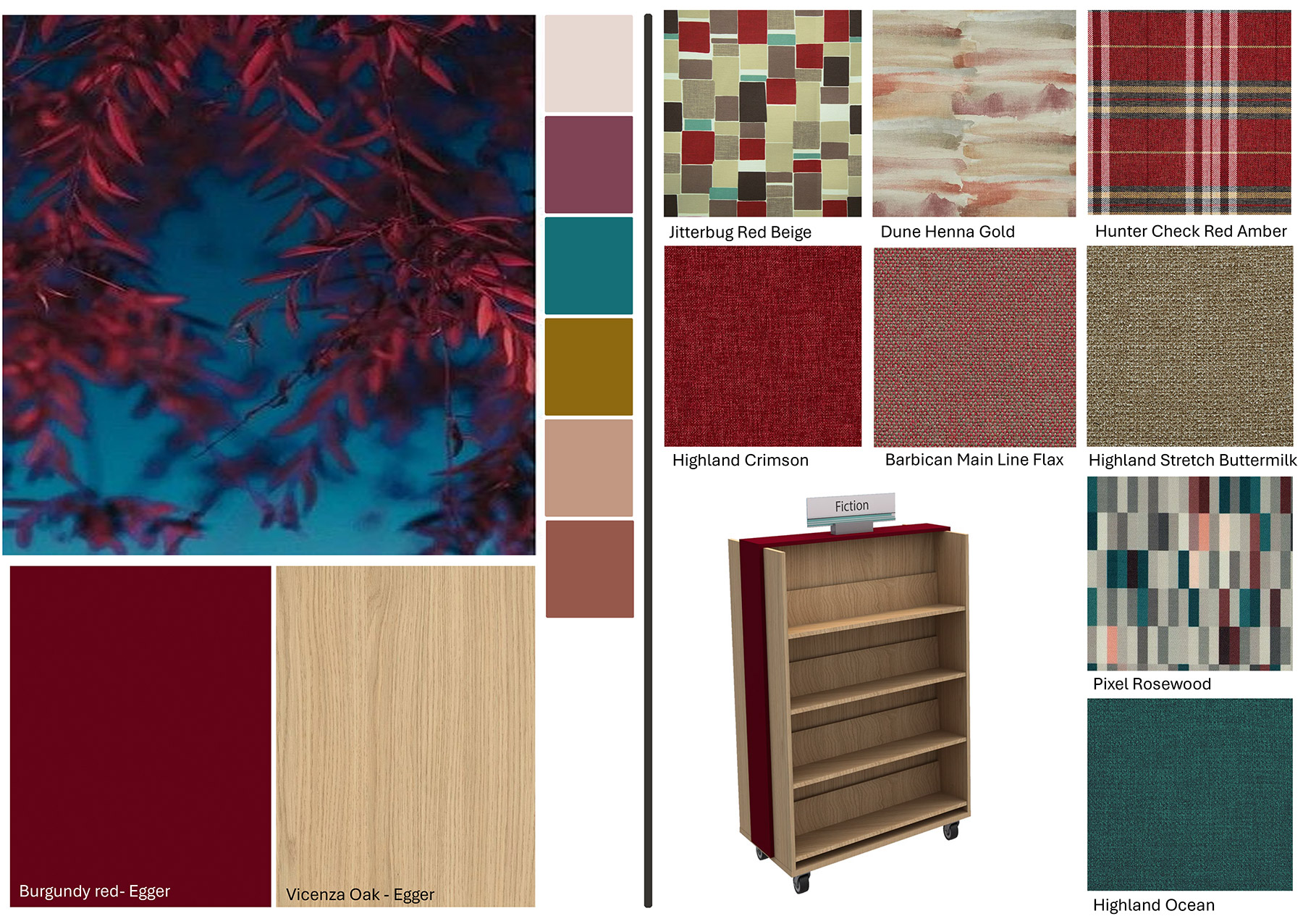
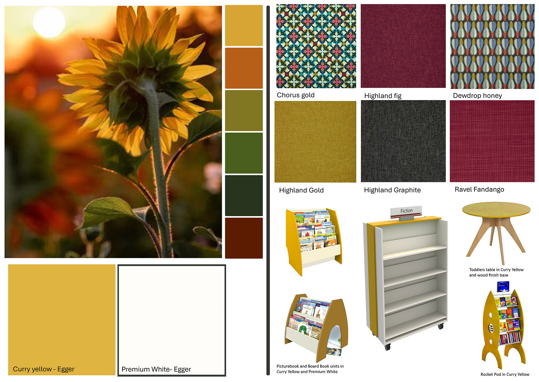
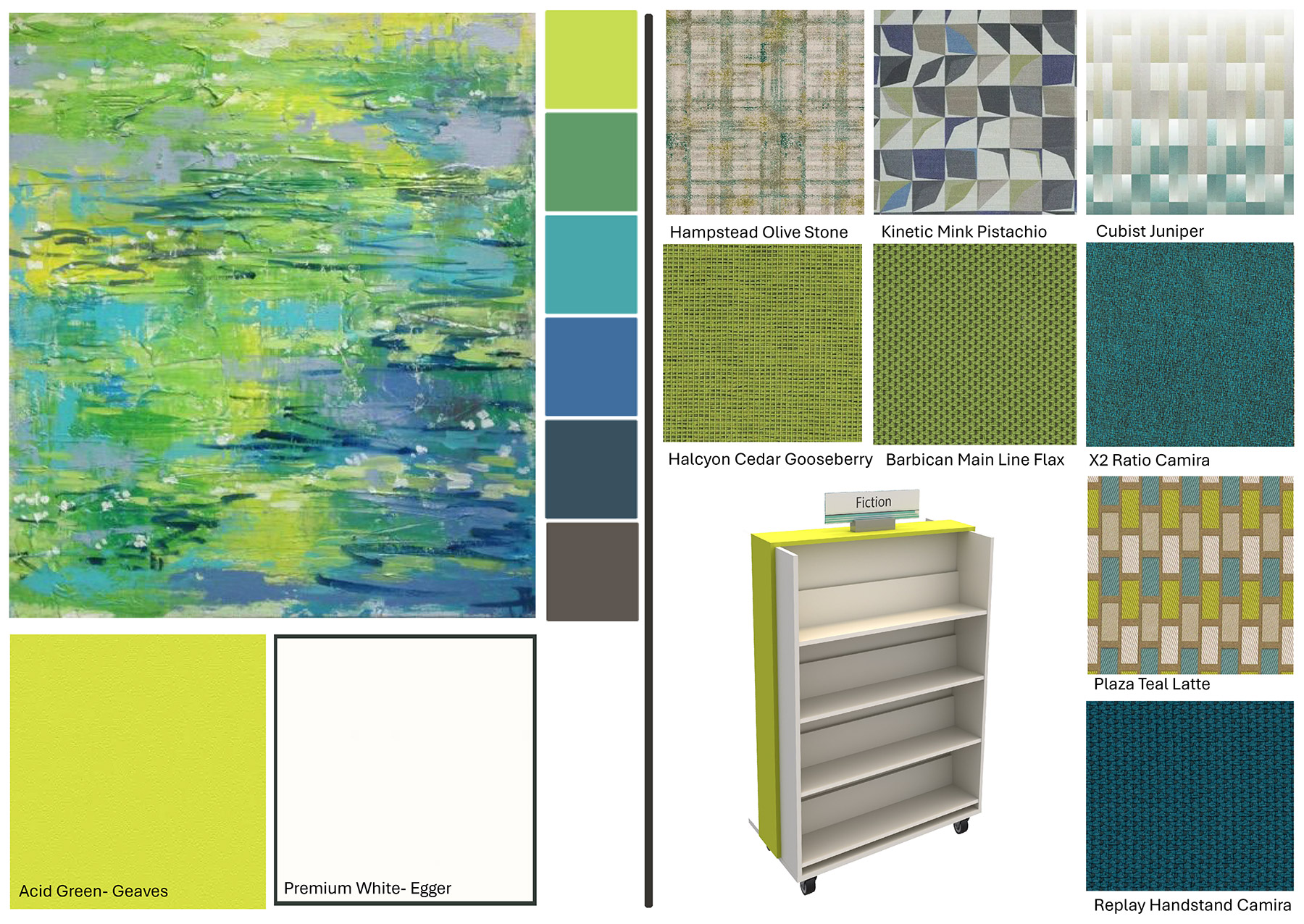
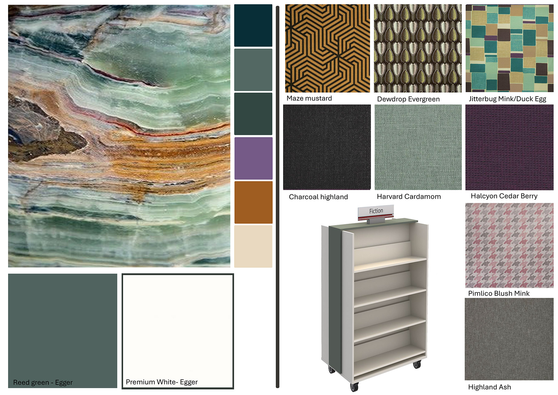
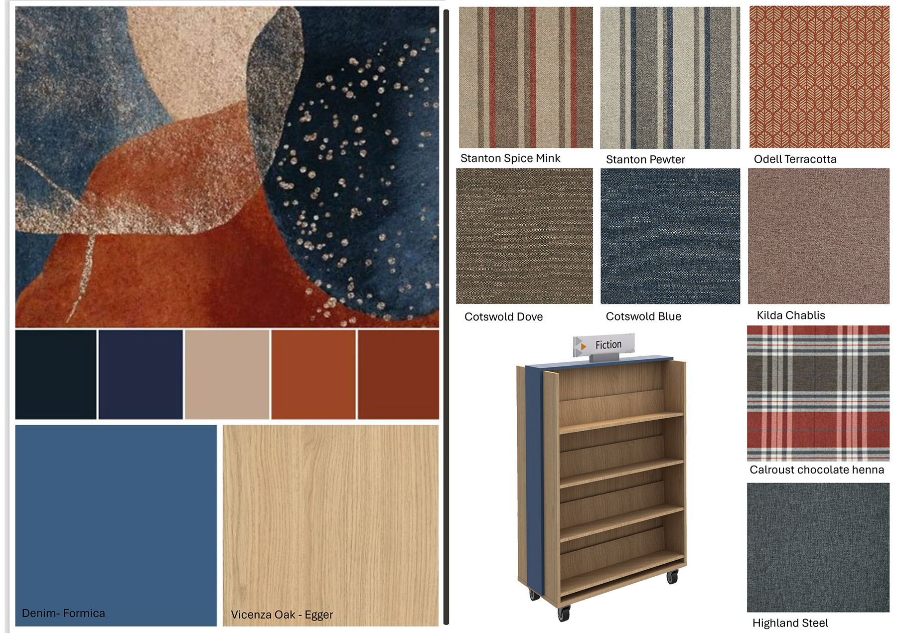
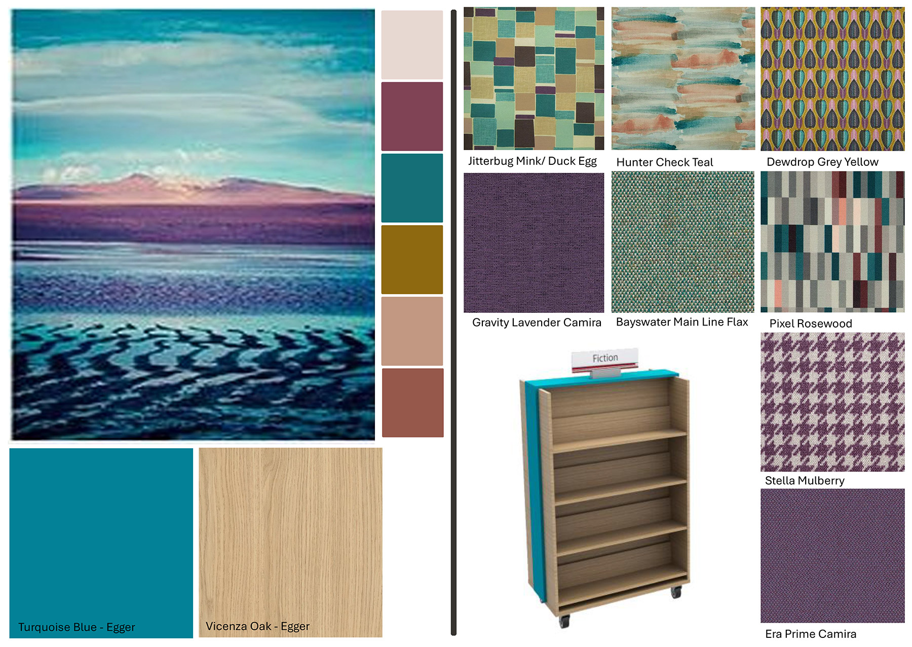
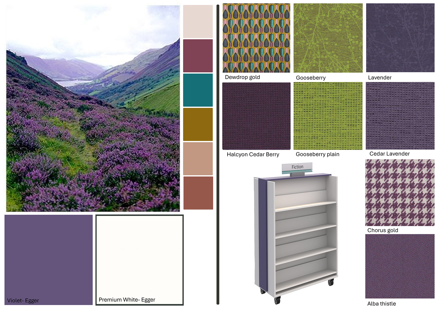
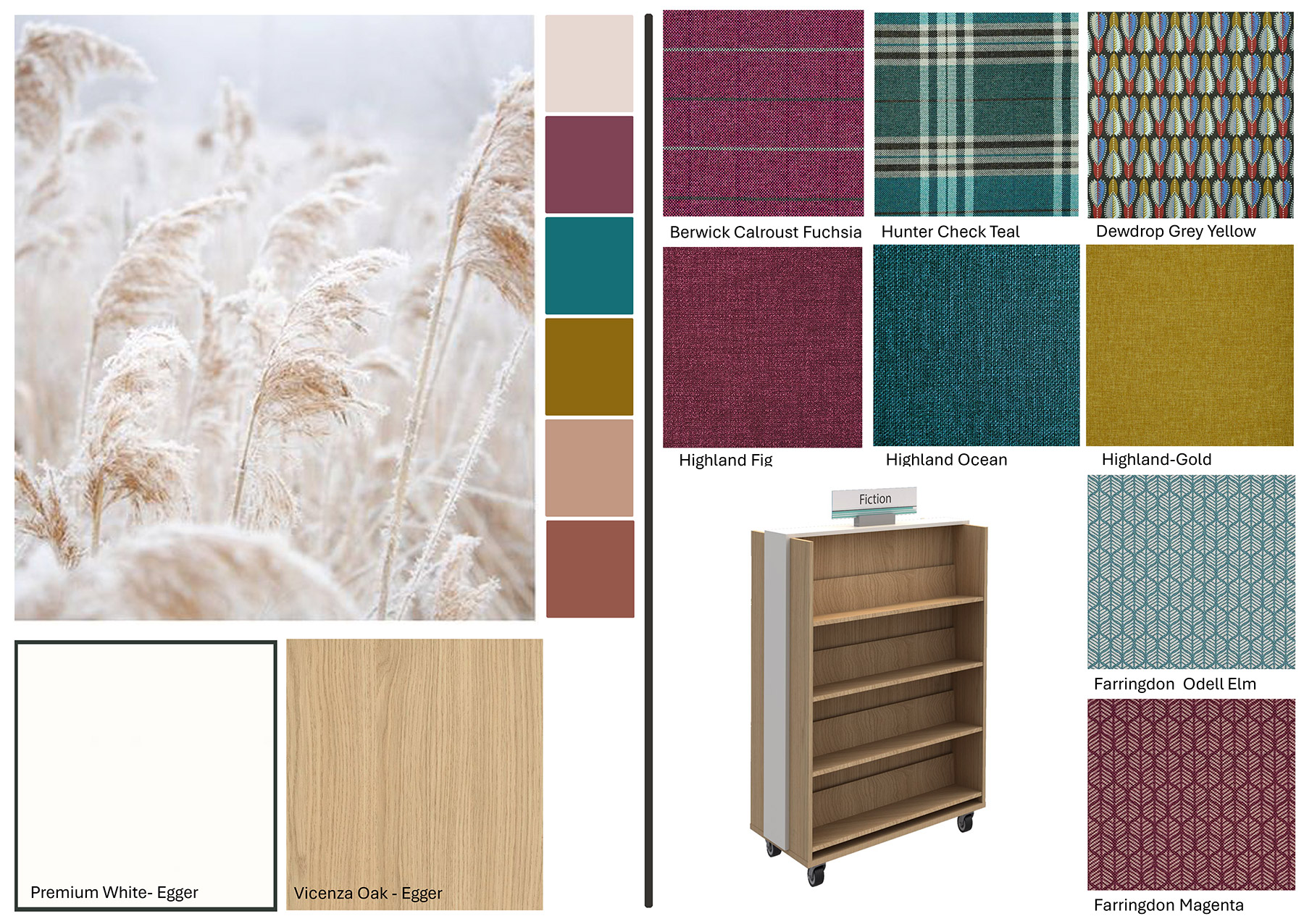
← Scroll to browse all 8 colour palettes →
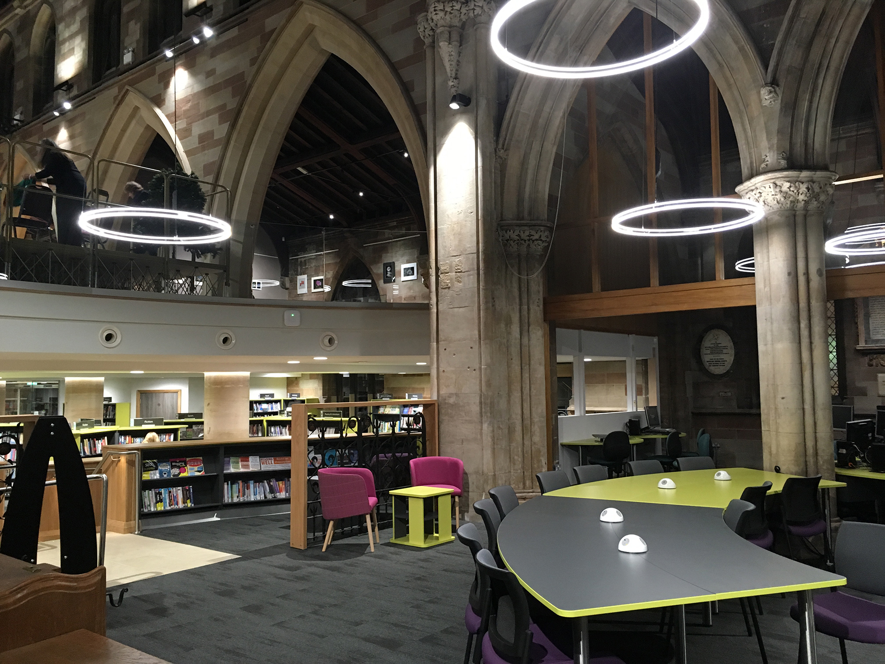
Opening the Book brings a new approach to interior library design which harmonises the interior layout with the shapes and volumes of the architecture. We work to maximise architectural features and play to the strengths of the building. An interior design will always look better where it follows the original dynamics and finishes of the building — if you have 1950s’ concrete, that’s what you must learn to love!
We have helped transform cinemas, supermarkets, churches, restaurants, gyms and training centres into libraries as well as modernising many Carnegie libraries. Contemporary glass and steel buildings bring their own challenges — fewer walls for shelving mean our dynamic approach to collection capacity becomes vital.
← Scroll to browse all 6 case studies →
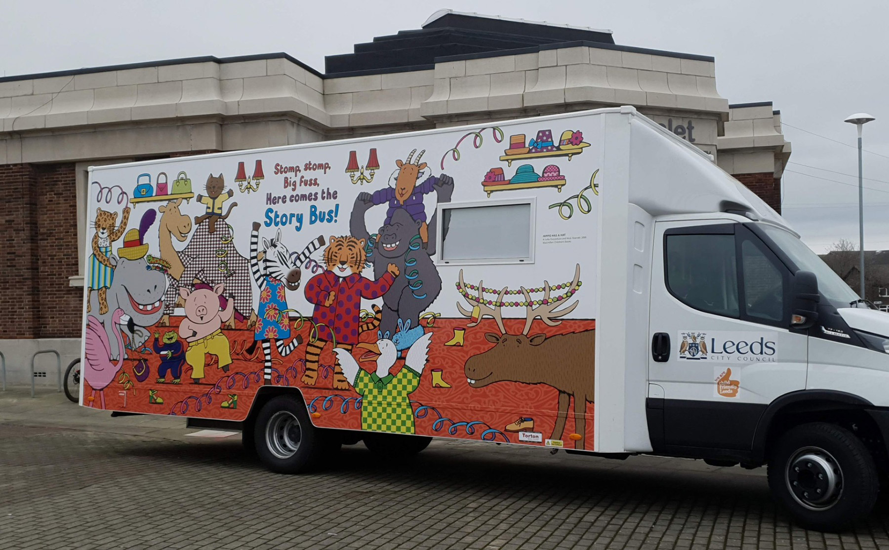
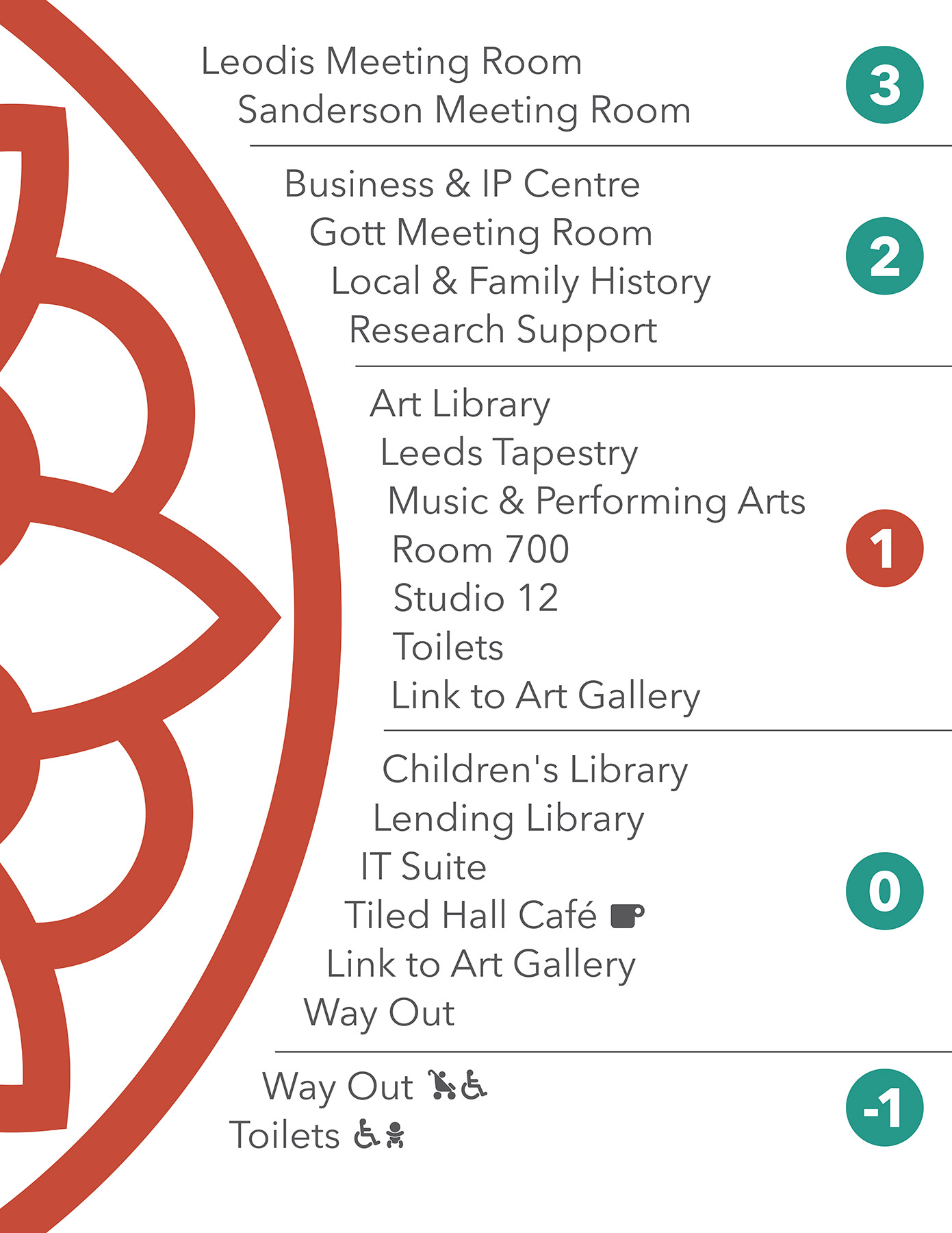
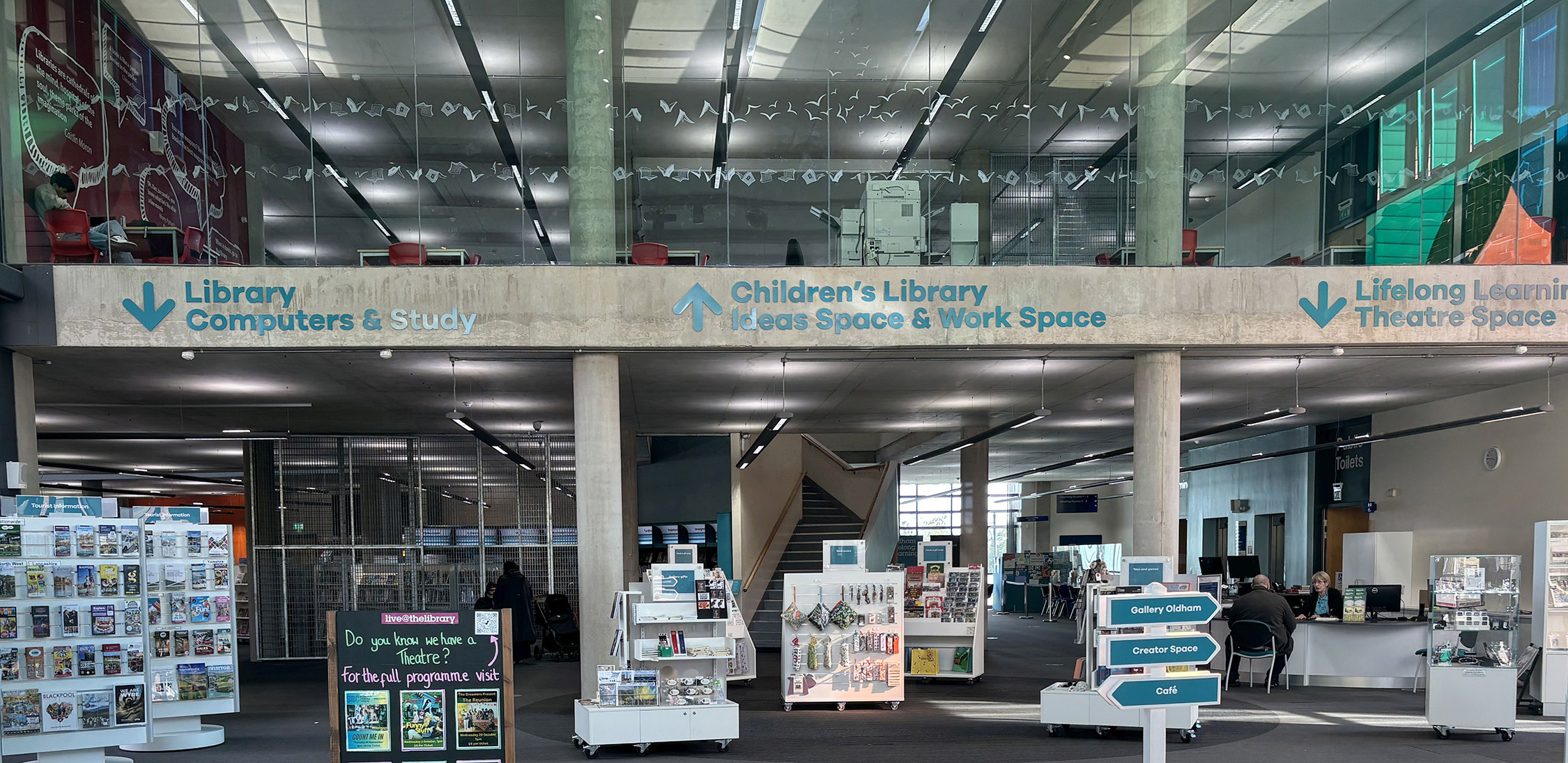
We take the same integrated approach to the provision of signage and graphics as we do to the rest of our design aesthetics. Signage and graphics don’t need to be purely functional or an afterthought — at Opening the Book we treat them as a key factor in the overall look of the space.
Window manifestations are a health and safety necessity but they can be given an extra dimension to make them a stunning and eye-catching addition to the building. We designed window manifestations showing local wildlife for an agricultural college library and cogs and wheels to reflect the industrial heritage of a town’s public library.
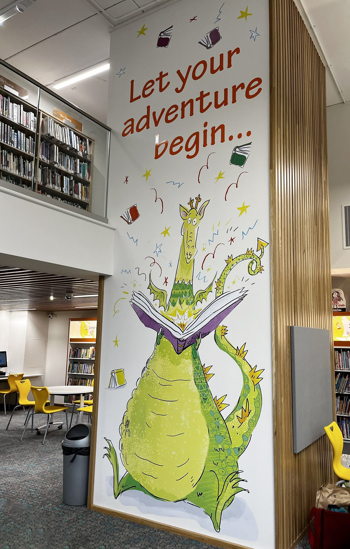
Graphics in children’s libraries are especially important to make a space feel warm and interesting rather than formal and intimidating. We have worked with children’s authors and illustrators to adapt their work to give a richness and depth to the experience of the space.
Children’s drawings submitted as part of a competition in one community library were used, with professional help, to brand the whole children’s area, appearing as wall graphics and on bespoke printed cushions.
← Scroll to browse all 5 examples →
Also in Library Design
Whether it's a new build, refurbishment, or co-location — we'd love to hear about your project and how we can help.


